By Wallace A. Wyss
As an admirer of both Rolls Royces and Italian coachbuilders, I would have thought that an Italian coachbuilder taking a Rolls chassis and redoing it end to end would be a good thing.
Wrong.
At least in the case of the Hyperion, a one-off built by Pininfarina for a wealthy American. It is one of three cars built lately for discerning people who wanted something “extra special,” including, lately, collector Jim Glickenhaus’ Ferrari inspired by the Ferrari P3/4 and a rebodied Scaglietti Ferrari, called the Scaglietti “K” for Peter Kalikow.
A collector and the owner of a Rolls-Royce Drophead Coupe had Pininfarina turn his new RR Phantom DHC into a two seater that recalled the 1930s long bonnet, short tail two seater.
Pininfarina has done other Rolls-Royces , at least one Silver Dawn saloon in 1951, for example, or the production Camargue coupe of 1975.
In some cars the mistake starts with the first line drawn, at which case it becomes ever more difficult to make the design right the further along you go. PF moved the driving position further back (400 mm) and took out the rear seats. The long hood looks long because they created two compartments in front of the windscreen “for small items or for sports equipment, such as the customer’s hunting rifles, says PF (what sort of rifle, we might ask?, and so would Customs)
They used new technology, a body of carbon fiber, but inexplicably have doors of solid wood.

All sorts of suppliers wanted to be in on it, and some were chosen: Fraschini for the carbon, Isoclima for the glazed surfaces, Proxi engineering for the drawings of the car, Triom for the lights and headlights, Fondmetal for the wheel rims, and Materialise for the fast prototyping.
THE FRONT
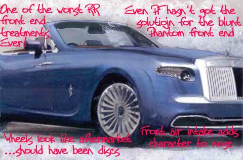
They tried to correct the terrible gothic front end of the stock Phantom by adding a front undertray airscoop that looks good. But their solution for the tiny Rolls headlights is some bizarre shape that looks only marginally better.
THE REAR
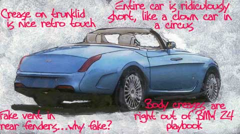
Perhaps inspired by the Facel II, they have blade type taillights on the rear fenders, a tad too big perhaps. The sharp crease in the bootlid reminds one of the Silver Cloud, though it’s sharper than the Cloud. The rear cutout for a vent is only half finished with no vent–equivalent to the dummy hood vents on the ’63 Corvette.
THE SIDE
The car is worst from the side, because it has a long hood, a too short tail and a ridiculously small cockpit that makes it have all the clownish proportions of a circus car for clowns.
The only car I can remember with similar bad proportions is the “Milan” a Cadillac of the 1970s made by a custom shop that would hack a four door sedan into a two door convertible, still using the front doors.
The side sculpturing is straight off the BMW Z4, over-wrought and over-baroque (RR is owned by BMW, by the way).
The side view is the fatal stroke. They either made the doors too short or the cockpit too short. I know, it’s a two seater, but recall the four to five seater RR Silver Cloud drophead– that car had the same wheelbase as the four door sedan and lengthened side doors compared to the four door. The wheels look like any mag wheels bought anywhere when they could have come up with special one-off wheels recalling some aspect of Rolls’ history.
INTERIOR
They blew the chance to do a new interior, whereas the stock Phantom interior when you sit at the wheel looks a little like you are sitting at a giant grand piano, with layers of wood before you. When probably spending more than a million, what matter if they spent a bit more on a new interior?
IN SUM
This one is so far off, we can’t even say “close but no cigar”. We have long admired the Pebble Beach practice of unveiling new concept cars on the upper lawn but as soon as we saw this one, we looked about for some reasonable explanation (not finding any, not having the program yet). But there can be no explanation other than the line in the Barbara Streisand’s song where she says “Sam, you made the pants too long.” In this case it was “Pininfarina, you made the cockpit too short.” As a result, they got the whole car’s proportions wrong and the million plus spent and all the craftsmanship devoted to it were squandered as a result.
you don’t understand.this auto is for 007.hence the rifle,machine pistol,grenades,ect……….
Looks like the newer Ford T-Bird that someone modified with a Rolls Royce nose. Like they use to do to Beetles.
Mr. Wyss neglected to include any drawings of all the beautiful cars he designed.
How sad! What’s happened to all the designers? I thinka whole lot of them are not Eyetralians any more, rght? Something has happened designwise, and it’s awful: everyone is by now subliminally influenced by “safety” ideas…thicker everything, puffier everything….ook at the new Ford GT compared to the size of the original (which was almost tall enuf inside for Gurney). That prototype “new Miura,” a monster next to the original. Anyway, Modern R-Rs and ugly cars. But if you’re inside they still do a decent job. My criterion: pretend all the wood is plastic and then judge it. It’s un imagining current economy cars with walnut interiors in exactly the same shape as the plastic…aterials make a heckuva difference
I didn’t include a list of cars I designed because I am a critic. I think 99% of movie critics have not produced, directed or written movies (though they probably have a script in their desk…). I find auto criticism something few editors want to touch..and few designers because if they are on the outside looking in, they are afraid their criticism will prevent them from getting even a temporary assignment. Thus one car after another goes uncommented on, regardless of how dumb a design it is. Since I am not a designer I don’t have to worry about this. I am a marketer and have assisted in marketing many cars, going back to the “muscle car” era.
Dear Wally,
First of all, you are right on the money on this analysis, although in this case it was like shooting ducks in a barrel. I always wondered why, with all the car magazines I read, Bob Cumberford was the only person doing this kind of critique, and when I read your article it occurred to me: you have to know how to draw, duh! You know how to draw. And by golly you know how to tell a good line from a bad one. Be advised that proper etiquette allows you to ignore trite messages sent anonomyously too. Your comments about criticism are of course correct. But this assignment was an easy one: how about a tougher one, such as an Alfa Giulia sedan from the mid 1960’s or a comparison of all 3 series of the Lancia Appia?
Best Wishes,
Brandy Elitch