By Wallace Wyss
Photos Courtesy Artcurial Auctions
It seems, at first glance, a superfluous effort to do a design critique of a design that is over 50 years old, of a car that was never in production.
I used to think that about Robert Cumforford’s design analysis of one-off cars. But then I had a re-think. I realized that sometimes a design critique helps us elucidate why we like the car; or highlights trends at the time that we, perhaps raised in different eras, didn’t appreciate.
So here’s my take on this long “lost” car which, turns out, wasn’t really lost at all, just well-hidden in deep storage by an owner who, having been a key figure in real racing, wasn’t tempted to bring it out for vintage racing. (Count Volpi was even quoted at one time saying in effect that even if you owned one of these cars now, it could never be the same as owning it then; as if you can’t repeat history…)
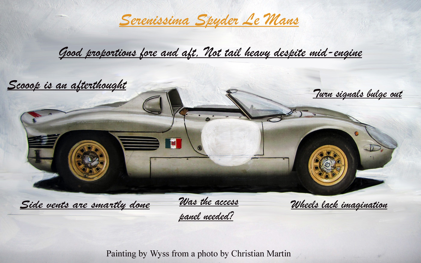
Here’s one critic’s take on the design
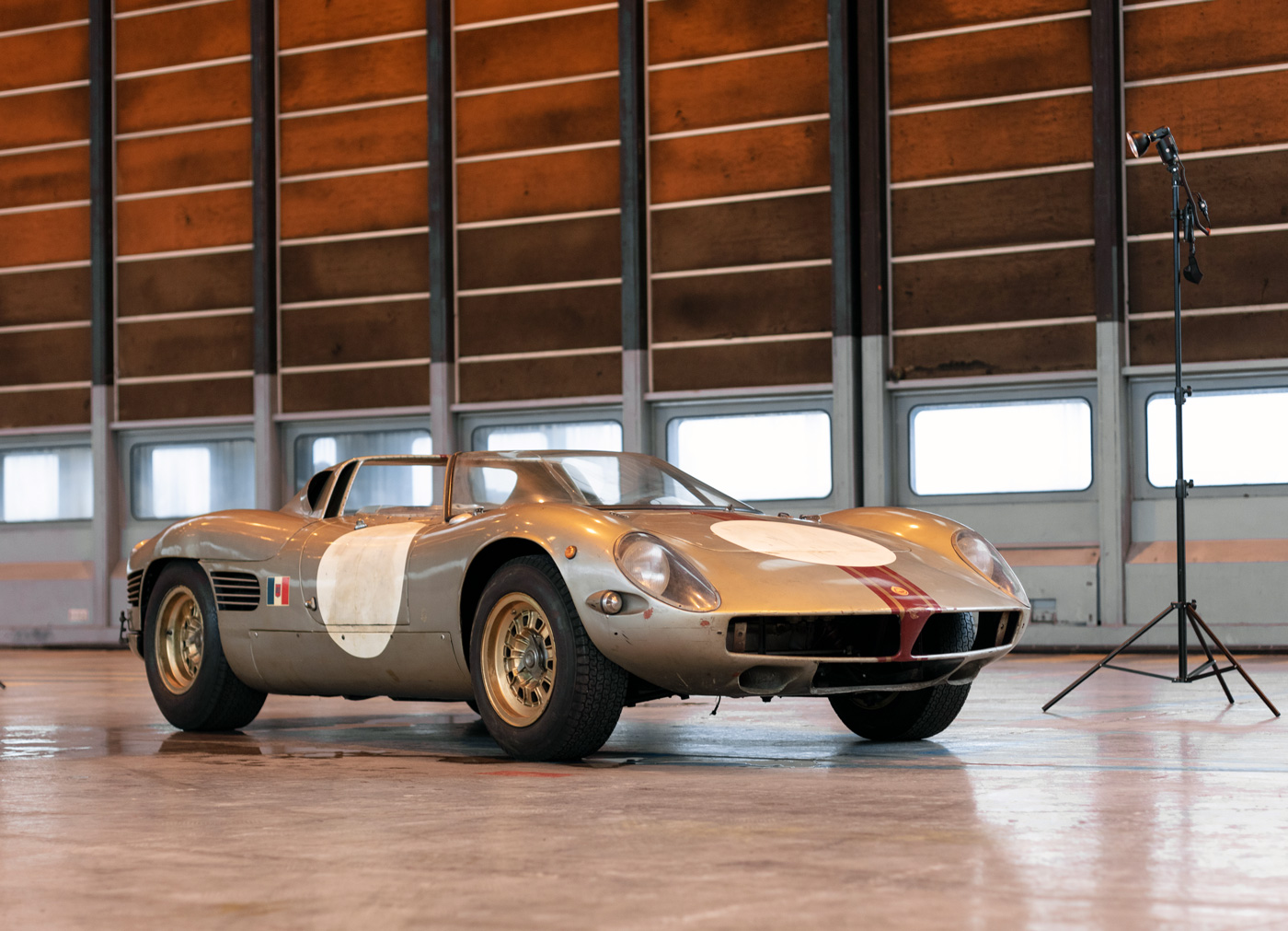
FRONT The split-grille mouth is similar to Bizzarrini, but still different. Looks like, if they would have thought about it, they would need a chin spoiler eventually. Turn signal blisters bulge out too much, disturbing the beauty of the body curves.
SIDE: Really great are the Giugiaro –like side vents (used in his Bertone Ferrari SWB 250GT) that start in front of the rear wheels and continue in back of it. Proportioning is a bit better than the Ferrari 250P by which it was obviously inspired.
Scoop on B pillar sail panel looks to be a bit of an afterthought (pirated from Porsche 904GTS?) and you wonder if it’s really needed? Where is it funneling air to? Wheels are not as interesting as those on a Ferrari prototype of the time.
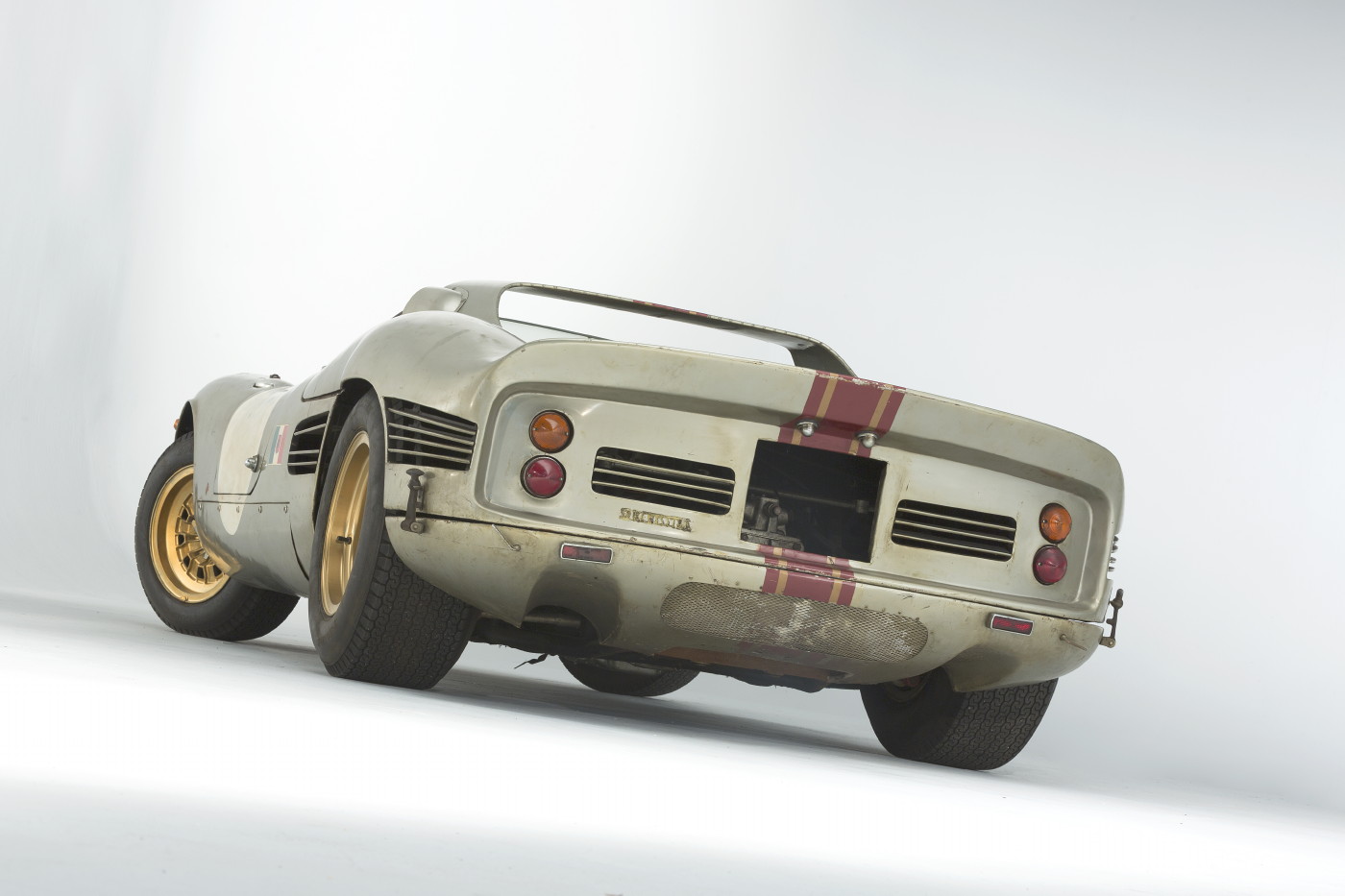
REAR:This is the angle where the car, in my humble opinion, is most flawed because somehow it’s all flat. Where it could have ended up in gently rounded surfaces, it’s like someone backed the clay model (even though they probably didn’t use a clay model) up against a circular saw and sawed off the ends so it looks chopped off. The rear spoiler is a bit too upright. Amazingly, the bottom part of the rear looks like a modern safety bumper covering. In the Orly Airport pictures, where it arrived for the auction, the rear bottom panel seems poorly fitted but this will no doubt be corrected.
IN SUM: This is without a doubt a world class design. It’s too bad the designer doesn’t get much credit. Mechanically the car was quite innovative as well, as proven by its maiden Le Mans effort, something the De Tomaso 70P of the same era never made, so that makes it a real racer not a wanna-be like the De Tomaso. You can’t help feeling that this car didn’t receive much publicity at the time because Enzo ruled over Italian journalists, admonishing them not to publicize Serenissima, but now that the car is out and about, we, as enthusiasts, can appreciate the Serenissima marque as the would-be David standing up, albeit ever so briefly, to Ferrari’s Goliath…
Read an interview with Count Volpi.
THE AUTHOR: Wallace Wyss has lectured on car design history at the Art Center College of Design. As a fine artist, he is currently doing commissions from folks who want an oil painting of their car. He can be reached at mendoart7@gmail.com


Very interesting article, thanks.
I love a goo0d design article and really liked hearing your take on it. For me, design is a question of approaching it at a very wide angle, swooping in on the details and then backing off to a happy medium where the car is seen by most, at a human angle and height distance.
The car looks like a happy median between Italian and German design. The Porsche 908 meets Ferrari 250P.
What I like most about this car is that if doesn’t hit a 100% flow appeal, it makes it up with little mechanical details, such as the rear vents and I actually like those front blinkers. They stand out just enough to remind you it’s a car and has a practical purpose.
I was having the same discussion with Benoit Jacob, now at Byton who penned the BMW i8. A car has to elicit emotion and most of the time, at least for my taste, does too much emotion and not enough “let’s get down to the dirty work”, or the feeling that beauty meets practicality. In this instance, this car has enough appeal balance with enough hints that it’s a race car. I like. It’s not perfect, but it’s darn close.
Great idea of an article. More please!
Thanks for the concurring opinion. I think the Boxster pretty well captures the same shape and we’re more than a half century later. I think the threat of Serenissima caused Enzo to move into accepting the concept of mid-engine street cars. Too bad the Count didn’t keep the pressure on…
The 1966 Serenissima Spyder brought an auction-record price of more than $4.7 million, way way above auctuin company estimate of $1.5 million.