By Paul Wilson
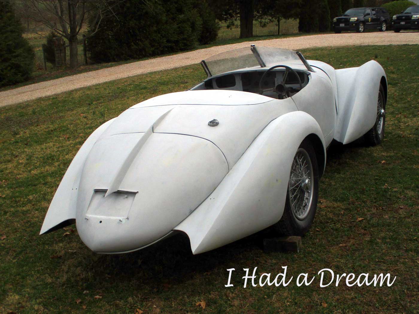
To complete my Alfa’s body I still had to construct the center body, with the cowl and doors. But first I had to solve several aesthetic dilemmas. I was unhappy with the rear view, and I wanted to take care of it–at least improve things–before going on. The rear deck looked too wide and bland, and somehow I needed to incorporate a license plate and taillights into it. Making a suitably racy windshield would not be very hard. But a curved, downward-sloping hood line, to harmonize with the car’s aerodynamic look, was surprisingly difficult.
I wanted the car to be exciting and beautiful, appropriate for an Alfa, and consistent with the car’s build date of 1948. By itself, each of these criteria wasn’t too demanding, but the combination of all three was a challenge that caused me many sleepless nights. This wasn’t just a street rod, expressing personal tastes of someone living in 2021. Mechanically it has everything that Alfa supplied to any other coachbuilder when it was new. So the body had to be something that could have been built then. Obviously it couldn’t have fiberglass panels or LED lights, but using authentic materials was the easy part. The design took far more imagination, and lots of research. I had to project myself into the mind of a period designer, and use the themes and assumptions of that time, with no anachronisms. He would have understood that a true Alfa was an exotic high-performance car, and should look the part. Being Italian, he would have avoided the bulky shapes and heavy chrome trim of German cars, and the fussy fantasies of the French. And he never would have seen many features of later cars that we now take for granted.
In 1948 he would have had many options for the appearance and position of lights, which were quickly evolving. Up to this point both headlights and taillights were considered add-ons, functional accessories that many makers, especially in Europe, bought from suppliers like Lucas, Bosch, Marchal and others. Headlights were always important in characterizing the “face” of an oncoming car, but aside from their size and position, they looked about the same through the ‘20s and most of the ‘30s, gradually elongating as the streamlining ethos took hold. But nearly all the Alfa 2.9s mounted them in separate pods. Only in the late ‘30s were they incorporated into the fenders. The ‘37 Ford, some 6C2500 coupes by Touring in ‘39, and the Volkswagen all had attractive sloping lights, giving me a convenient excuse to steal some VW units for my car.
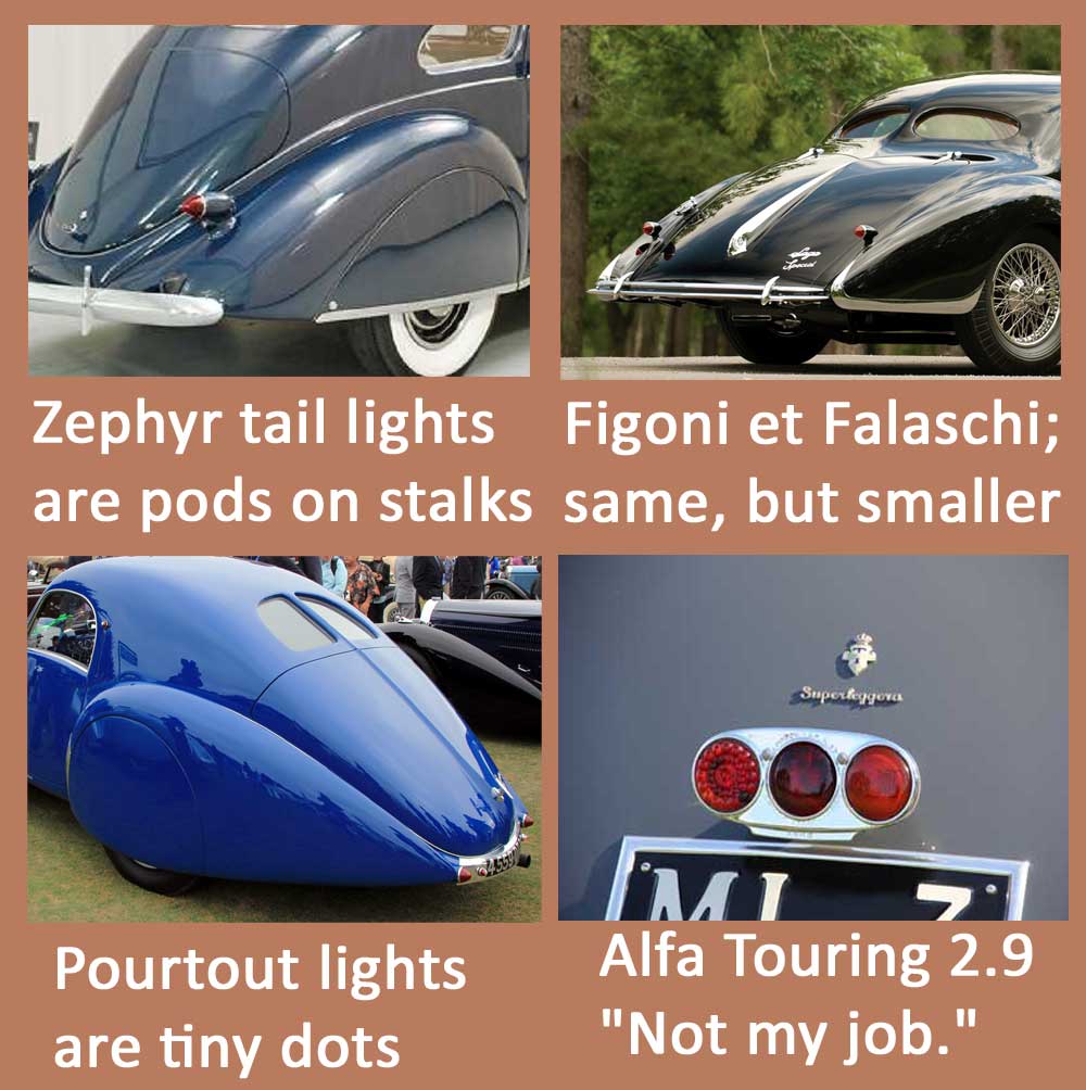
Taillights were an afterthought. If I borrowed a design from the ‘30s, what did I have to choose from? Not much that I like. The ultra-aerodynamic Lincoln Zephyr, in 1937, put bullet-shaped taillights on stalks rising from the rear fenders. Figoni & Falaschi, using a similar shape, tried to make them less conspicuous by making them much smaller. On one of their Talbot-Lago T150SS coupes, Pourtout reduced them to tiny red dots on either side of the license plate; on another, they placed them at the top of the trunk lid. Clearly, nobody wanted taillights interrupting the smooth sweep of the rear lines. Simple round lights mounted flush with the body, as on the Darl’Mat, did no harm. But the message given by the designer of the Touring 2.9 is that “taillights are not included in my job.” On the back of one of the most beautiful cars ever is a cheap-looking light unit from a supplier, bolted to a bracket above the license plate.
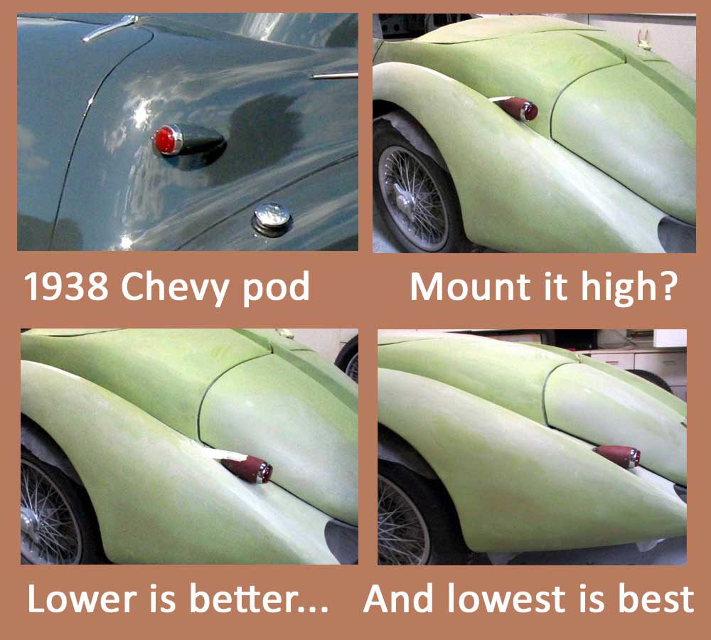
Americans were ahead of most Europeans in taillight design. By 1941 all American cars had them integrated into body panels. The ‘39 Ford had particularly attractive small, teardrop-shaped lights, mounted flush with a slim chrome surround. Could I use these? Well, no. They are instantly recognizable due to their popularity on street rods. And no European coachbuilder would have used similar lights, even postwar. Pod-shaped housings were popular there, and the lights became less obtrusive as they got smaller and began to sink into the body contours. The 1938 Chevy had suitable lights. I got a pair, and checked how they looked in different positions. When I cut them down to align with the fender slope, and painted them body color, they blended well with the overall design. Very European, just right for the period.
European designers back then would have reacted just as I did to the rear view of my car: too wide, no character. Even a simple rib, or spine, up the middle would suggest movement, and align with the slipstream. And why not a fin? Airplane tails were needed for stability. Shouldn’t a high speed car have something similar? Lots of dorsal fins–on the body center–appeared on late ‘30s custom bodies, usually on coupes but also on roadsters. I liked the idea, and taped a styrofoam fin to the car. It looked good, very ‘30s. But where would I put the license plate? Placed off-center, it looked terrible. In the middle, it would interfere with the fin. And how would a flat, foot-wide rectangle harmonize with the smooth aero theme? It wouldn’t. European plates of the time could sometimes be small, and were often painted on, but they were still unattractive. They’re simply left off most concours queens, not needed for the quick trip from the trailer to the show field. The Darl’Mat gives one answer to the dilemma, putting the plate under a plexiglass cover that follows the body contours. A few Alfa bodies made by Zagato did the same. I made a similar curved cover over a set-in area for the plate, minimizing the visual impact of that ugly black rectangle.
So with the license plate in place, what should the fin look like? I tried a modest low ridge–too timid. Continuing the ridge below the license plate seemed too fussy. How about a big fin that sailed right over the license plate? Too weird (though many period designs were pretty weird too, so I had some flexibility here). After trying many sizes and shapes, I settled on a fin that terminated in a spear (which could house a light). A friend suggested that a trunk handle might continue the line below the plate. I tried one from an XK150, which showed that the idea had promise. But the handle was too big, and its pushbutton looked too modern. A simple curved handle worked well. And there was another problem. A two-piece fin running from the rear deck onto the trunk lid looked best, but what about where they joined? The gap needed to be just the right arc, so nothing would interfere when the trunk was opened.
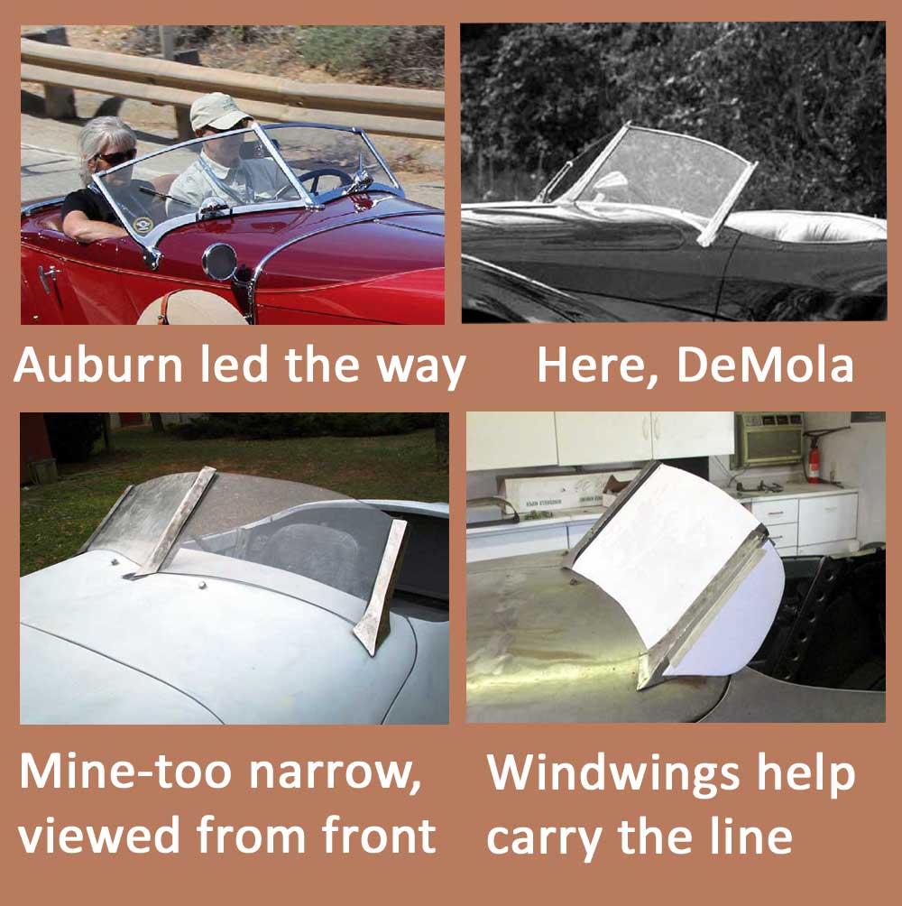
Though flat windshields were more common, rakish vee-shapes were certainly an option for the period designer. Amilcars and Auburns had them in the ‘20s, Zagato put them on a few Alfa bodies, they appeared on some Bugatti Type 57s and Mercedes, the DeMola roadster used one. I tried to find something ready-made for a motorboat, but the ones I found would take more work to modify than building one from scratch. So I got out my welder and set to work. The result looked good from the side, but too tall and narrow from the front. The width was limited by the header bar, which had to disappear behind the seats when the top was down. The aesthetic solution, also a practical advantage, was wind wings.
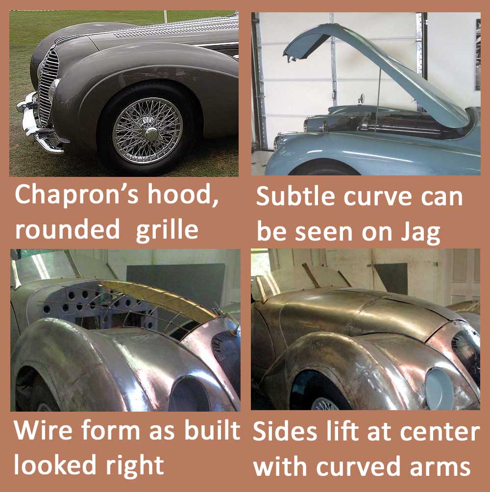
For decades, all cars had had a perfectly straight hood line that terminated in a high, proud radiator. But as body contours became more rounded and streamlined in the ‘30s, a gentle downward curve would be more harmonious. The problem was that a center hinge must be straight to avoid interference when one side is opened. So as curvaceous forms developed in the ‘30s, just a single rigid straight line remained–the hood. It wasn’t as if period designers didn’t recognize the conflict. The easiest solution, seen on Chapron’s Delahaye 145 and others, was to put the hood opening as far back as possible, allowing at least the front section to be rounded. On late ‘30s Chevys the hinge ended well behind curved hood extensions to the front. The Jaguar XK120, introduced in the same year as my Alfa’s chassis was built, shows how desperate its designers were to soften that stiff line. Just for a subtle curve, and to eliminate the shut line above the grille, they created an enormous one-piece hood more than five feet long, held by wobbly complex hinges at the back, made of aluminum to keep it manageably light. Even that was not as radical as the elaborate system Buick designed for early postwar cars, that combined hinges and latches so the entire hood could be lifted alternately from one side or the other. It wasn’t an easy problem to solve.
So, what could I do? I agreed with the Jaguar decision, that the improvement in appearance justified bold measures. Making a ghost image with wire forms showed that a downward curve looked much better than a straight line. A hood that gave good side access couldn’t be hinged from the back like the Jaguar’s, and would be too big and heavy unless it was divided into two sides. To get around the interference problem, instead of a straight piano hinge I made a pair with curved arms that pivoted from opposite the center line to lift the center edge as it was opened. When closed, this system doesn’t fit as tightly as a piano hinge, but I decided that the tradeoff was worthwhile. I doubt that many observers would be able to explain why the front of my car seems different from most others of that time. But it’s a real improvement, I think.
It’s a good thing I’m not paying someone to do all this fussing and tinkering and dead-end excursions. The cost would be astronomical. But my time is free, and materials are cheap. It’s a long process, though, and the perfect car has yet to be created. Luckily, I have no thoughts of selling my Alfa, so I only need to please myself. Sometimes even that is a challenge, but I’ve enjoyed both the thinking and the making.
Next time: final steps in the body construction.



39 Chevrolet. also check out the 39 Pontiac tail light, rectangular, not round Those were the days
I love this detailed writeup concerning the style decisions.