In this article we will make a strategic and technical comparison of the design efforts of Pininfarina and the Cadillac Studio. I will try my best to be completely impartial in my assessment of their actions.
By Dick Ruzzin
Photos courtesy GM Design Archives
The Cadillac Allante as designed by Pininfarina should have been considered as a design influence for their 1992 Eldorado design proposal. However, the Eldorado presented to Cadillac Division looked nothing like the Allante. The Allante was the most expensive Cadillac at that time but it was quickly determined that the hoped for “Italian Design” cachet was not important to the American luxury car customer.
A major Allante flaw besides the design was the manual convertible top that diminished its market success; most customers wanted to push a button to raise the top. Pininfarina chose not to use any of the Allante design cues on their Eldorado proposal. Their proposal over the Cadillac Engineering platform also “looked” smaller than expected, still too close in size to the last small Eldorado, which was a dramatic sales failure. Pininfarina had the opportunity to make their proposal longer but chose not to.
The new Eldorado as the Cadillac image car would have to strongly influence the design of those cars to create the expected new Cadillac family look. The Allante had failed in that role. How the Eldorado by Pininfarina or the Cadillac Studio design went, so would go the rest of the line. It would be the key design statement that would set the stage for the other Cadillac cars in the American market. To make things more difficult, the new Seville design would have to be acceptable to foreign buyers and it was designed to do so.
COMPARING THE TWO ELDORADO DESIGN EFFORTS.
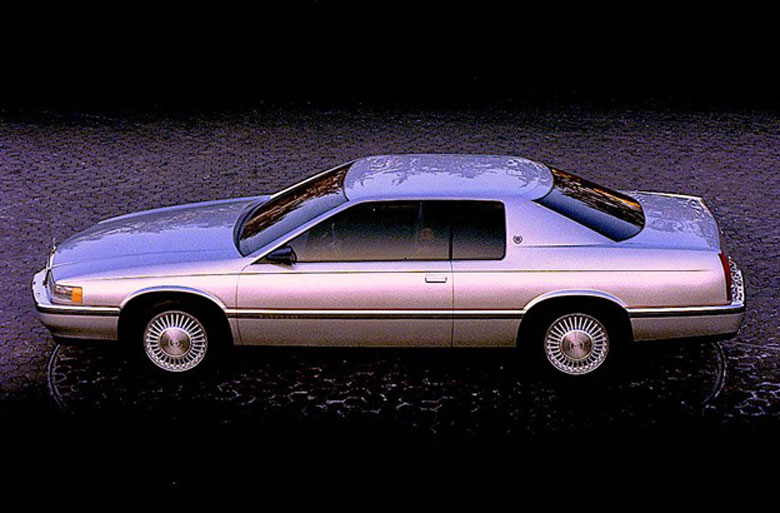
The three dimensional shape of the Cadillac Studio Eldorado even in this small image is very evident. The surfaces are sheer like the Pininfarina car, but also very curved. The Pininfarina car does not have the sculptural interest or graphic sophistication of the Cadillac Studio proposal. It is the shape of this car that makes it so entertaining when you are close to it. It looks like a Cadillac in every view.
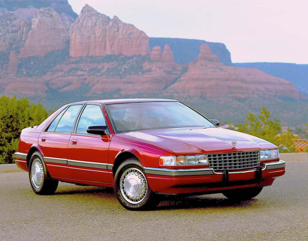
The 1992 Cadillac Seville was designed at the same time as the Eldorado in Cadillac Studio. Its basic form philosophy was the same as the Eldorado, linear longitudinally and rounded in its transverse sections. The Seville’s rounder sections aligned it with European luxury cars giving it a more robust look. The Seville appealed strongly to the import market and was very successful. This running show car was built in one month from a GM Proving Ground prototype with over 62,000 miles on it. Here in the Superstition Mountains for pictures on its way from Detroit to the 1991 Los Angeles Auto Show it was the first time that I saw the new Seville out in the real world and driving. It was a stunning experience for myself and Kyle Johnson from Cadillac Public Relations who had followed the design process closely.
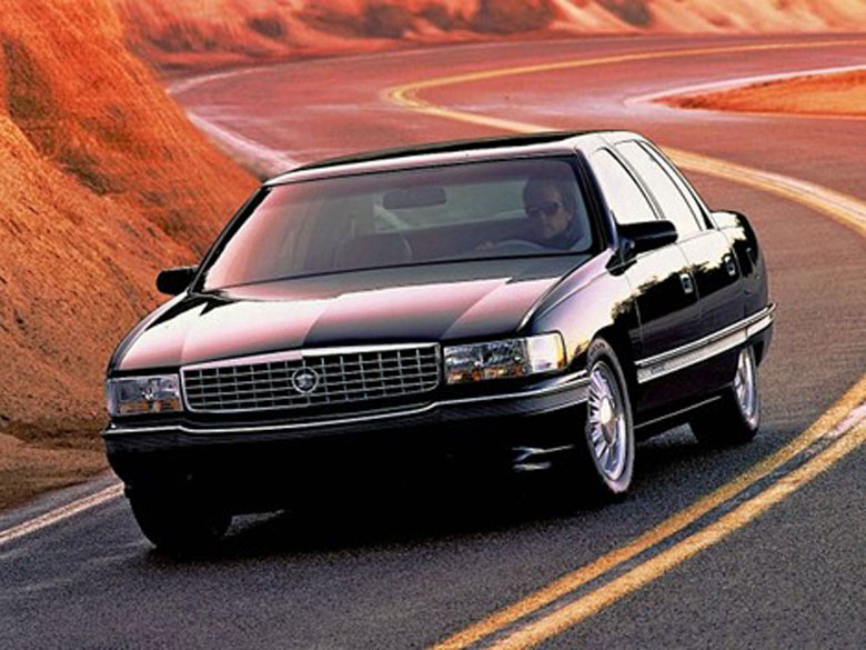
The 1994 Cadillac Deville was designed immediately after the 1992 Eldorado and Seville. It displays the new design character and many graphic and surface design elements from those two cars. All three cars show crisp profile lines and rounded sections which result in rich reflections as seen here. If the Allante would have had a front like this car it would have looked like a Cadillac and the rest of the design would have easily followed.
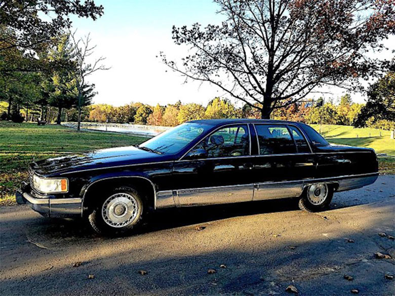
The 1995 Cadillac Fleetwood was intended to be the last big rear wheel drive Cadillac. Originally conceived in the Advance Design area by designer Dennis Burke it was inspired by the then recent Cadillac show car the Voyage designed by Gerry Brochstein. It was designed and released for production by a small team led by designer Scott Wassell within the Cadillac Studio. The Fleetwood was done during the flurry of design work that followed the creation of the Eldorado, Seville and Deville. It also was blessed with excellent aerodynamic performance.
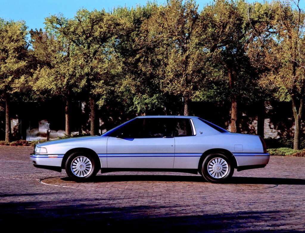
If Cadillac had chosen the Eldorado as presented by Pininfarina the following Cadillac Seville, Deville and Fleetwood would not have had the Cadillac form language and aesthetic design character that was available in the 1992 Cadillac Studio Eldorado. It was an evolution of the past Cadillac design culture which had been cultivated by Cadillac Studio for years. It would have been lost.
Design Definitions as applied to Pininfarina and Cadillac Studios
Below are technical terms used by designers and their definitions around the world. They are used in the following review of both Cadillac Studio’s efforts to design a 1992 Cadillac Eldorado and the Pininfarina car. Stated are their responses to each of these technical design challenges.
ARCHITECTURE
This term describes the complete assembly of the essential and basic functional elements that form the platform of a vehicle, its interior spaces, exterior size and volume distribution.
PININFARINA
Both design proposals shared the same platform architecture as developed by Cadillac Engineering to start the program. It was an evolution of the earlier 1986 platform that was too small. Pininfarina followed Cadillac’s original direction to define the size of their proposal.
CADILLAC STUDIO
On the contrary, Design did not agree with the Cadillac Engineering platform proposal for the Eldorado and Seville and presented designs that were longer than Cadillac Engineering had recommended. All parties then quickly agreed that both cars needed the extra length to make enough of a change from the smaller 1986 models.
PROPORTION
The length, width and height of all the related volumes in total that the designer must deal with when creating a car design.
PININFARINA
The Pininfarina Eldorado suffered from the original shorter length of the platform as provided by Cadillac Engineering even though it had been extended and was longer than the 1986 car. They chose to stay with the more European shorter proportions, Cadillac Studio proceeded to design a longer car.
CADILLAC STUDIO
The added length over the original Cadillac Engineering proposal was a significant factor in bringing the Cadillac Studio design into proportional alignment with the overall character of previous larger Eldorados. It also improved aerodynamic performance, rear seating and luggage capacity.
It also resulted in improved fuel economy.
DESIGN GRAPHICS
The two- and three-dimensional shapes of the various elements that are added or are part of the basic design form that provide the vehicle with a visual identity and the necessary road-going legal requirements.
PININFARINA
The Pininfarina design proposal had everything required to meet all legal requirements. The taillamps were of particular interest to us as they reflected past Eldorados. The front grille graphically was like a previous Deville which was clearly not appropriate. Glass openings were very coupe like but the most important graphic design element, the sail panel in the rear corner of the roof, was not even close to any other Cadillac and resulted in an overall weak design solution.
CADILLAC STUDIO
The Cadillac Studio Eldorado picked up the line on the side from the Allante to connect it to the design of previous Cadillacs. The front was thinner and wider looking than the Seville using the same headlamps and side turn lights. Even though the two cars shared many structural parts they looked very different. The side glass graphic shape and taillamps on the Cadillac Eldorado design were a direct reflection of previous Eldorados. A completely new plan view shape for the roof sail panel made the design special, that of a new and modern Eldorado.
FORM LANGUAGE
The overt and subtle surface development and the overall sculptural character of the exterior sheet metal and interior surfaces as created by the designer. This is the designer’s aesthetic signature.
PININFARINA
The Pininfarina Eldorado had a consistent character that was very professionally executed. The forms were well developed and supported the visual mission to design an elegant coupe. The car did have a “wooden” look, like the Allante. It possibly was created in plaster which limited the more fluid form development that is possible in clay.
CADILLAC STUDIO
The Cadillac Studio Eldorado was also very well developed and received enthusiastically as a beautiful car. With slightly more length the surfaces were slightly curved in all views, well developed and harmonic throughout. Of special note not easily visible in the images is the sculptural form of the Eldorado in total which is very elegant.
ARTISTIC CHARACTER
The aesthetic personality of the design is the message that it sends the viewer. Success of a car’s artistic character is confirmed by the compatibility of the aesthetic design and the cars functional mission and how well they work together.
PININFARINA
The Pininfarina proposal was carefully designed and consistent in its modeling. It was well detailed and surfaced and it had a consistent sculptural character. The design looked European and it appears that the car was created by a very experienced modeling staff. The design theme, however, was not strong or aligned with previous Eldorados with exception of the taillamps.
CADILLAC STUDIO
The Cadillac Studio design proposal was consistent in artistic character throughout. Its real strength was that it had a fresh, classic and new aerodynamic aesthetic that was highlighted by the rear of the roof sail panel. It looked American, sporty and elegant in a new way but most importantly it was unmistakably a Cadillac.
HARMONY
How well the design elements go together, the blending or contrasting of all the key aesthetic design elements for design effect.
PININFARINA
The Pininfarina design was well done, the surfaces were harmonious and overall the car was composed of smooth surfaces and accent peaks in the sheet metal.
CADILLAC STUDIO
The Cadillac Eldorado proposal was also well done with consistent surface development. Front, rear and side flowed together and it was a total design shape.
DESIGN CULTURE
As applied to an automobile, an aesthetic endeavor where art is bound by physics and science in the form of vehicle engineering and manufacturing. How well the design solution is accepted and stays relevant through time is a very important measure in the design evaluation of the 1992 Cadillac Eldorado and future Cadillac products that will share it..
PININFARINA
The Pininfarina Eldorado design model was a clear statement but in retrospect the design was not strong enough and very importantly did not look like an Eldorado. It did not visually connect with past Eldorados or the latest most expensive Cadillac, the Pininfarina designed Allante. The design also was lacking in elements that could be translated to future Cadillacs and it was not inspirational enough as a foundation for the following Deville and Fleetwood designs.
CADILLAC STUDIO
The final design solution presented by Cadillac Studio over thirty years later has a strong memorable character that combines a sporty and elegant personality with a hint of of drama and high performance. Very importantly it could only be a Cadillac. It was also a very good foundation for the following Deville and Fleetwood designs. In person when observed the 1992 Eldorado has a great shape as well as a clear Cadillac identity.
MY FINAL THOUGHTS
Pininfarina had been very successful for years in the creation of designs for Ferrari and Peugeot. In those two cases the Pininfarina designers knew what the historic design character was as well as the aesthetic expectations of those brands. In the case of the Cadillac Allante and the Eldorado they were at a disadvantage as it is possible that they may never have been placed in a situation where they had to continue a design brand character without any history to do so.
This has been a great series, getting the design philosophy and critique straight from the design team leader. While I have long admired Pininfarina designs (I’m restoring a Ferrari 330GT), I agree that their Eldorado missed the mark. Elegant, but too static. This is one case where I prefer the four-door to the two-door. The way the Seville’s grille drops into the bumper seems more aggressive and sporty than the Eldorado, as does the thinner, forward leaning c-pillar.
I don’t plan on replacing my 2002 STS any time soon.
Pininfarina and other Italian design studios were never good at designing “American” cars. Look what PF presented in the Fifties and ItalDesign’s bland AMC Spirit.
It’s a shame that the same amount of effort was not expended to put Cadillac on the same footing as the imports in regards to facilities. Cadillac did a commendable job designing these cars but completely ignored the fact that their dealerships were in dire disrepair. The buying experience was atrocious compared to Mercedes, BMW and especially Lexus. Most Cadillac points were still intertwined with Buick and Pontiac. Elderly salesmen in plaid suits did not ingratiate themselves either. What happened to Cadillac was and is entirely on the backs of GM management. Their recent efforts dolling up Chevrolet trucks to compete has further undermined the image.
Cadillac did understand the dealer problem but could not make a large impact in the right direction as the dealers are independant contractors. Also at that time many did not have the funds to match the Cadillac investment as the earlier small cars were such a financial failure.
The hard boot of the Allante looked cheap to me. I’d rather have an old fashioned soft boot for the folded top or flatter surface metal boot a la 450SL. . The lit up red light–the size of an apple at the rear above the license plate– seemed like a joke. Chuck Jordan told me as head of design he was not supposed to see it but nevertheless being personal friends of Sergio Pininfarina he did see it and comment so we wjll never know how it would have looked if left a purely Italian design.
Chuck Jordan saw the Allante in process as it was under development. Also after it was completed, as presented to him in the included image. No changes were suggested or made to my knowledge. Sergio Pininfarina invited John Grettenberger the Cadillac Vice president to see the car finalized before it’s released for production. He took Wayne Kady the then Chief Designer of Cadillac, to the review in Italy.
Sergio Pininfarina asked Wayne for any suggestions to improve the design and he responded. He suggested that the chrome header piece at the top of the front grill be executed in a slightly different way to emulate earlier Cadillacs as it would have been easily done. John asked Sergio what he thought of that proposal and he responded that he thought it shoud remain as it was as it “was perfect”.
This was a tragic error on his part as the execution of the front design with it’s horizontal lines clearly looked like earlier Lancias. The execution of the front end is very mechanical as is the rest of the car, not displaying the expected Italian form language. The above image of the 1994 Cadillac Deville that was designed immediately after the Eldorado and Seville had a front end that would have transformed the Allante and made it look like a Cadillac.
The execution of the boot surfaces, flat or curved, was defined by Pininfarina. The high level stop-light as required by US Federal law to be no more than four inches below the bottom of the rear window was also a special feature that Pininfarina chose, that is to make it round. Most at that time were horizontal but Pininfarina choose to make it round. To meet Federal guidlines it had to be that size.
The Allante was a nice looking car but not the right good looking car. Following the Allante with the Eldorado and Seville we worked very hard to achieve that goal.
Art is not easy to put into prose. It has been a great pleasure to work with Pete Vack who took my suggestioins as the writer very seriously. He is a very good editor. I think his presentation of the images in this article has been outstanding and I am proud of every image that he chose to include. He presented an article about car design that was done in an aesthetic way that represents the subject very well.
Thanks Pete, a complex story about a complex subject that showed many that designing a car can sometimes be a pretty hard thing to do.
Thank you!
Pete