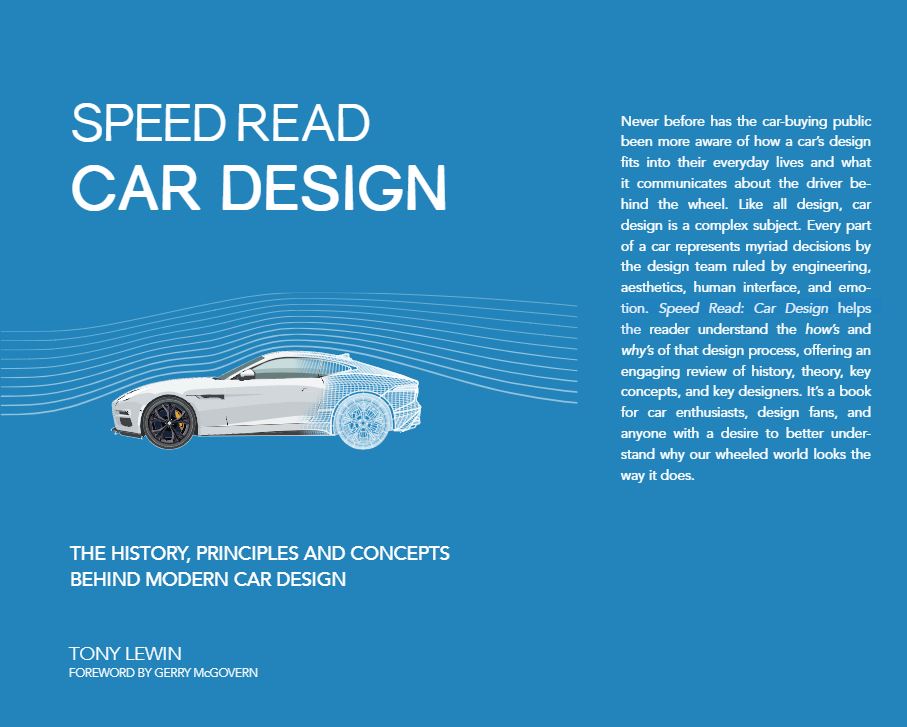
Car Design, the History, Principles, and Concepts Behind Modern Car Design
Author: Tony Lewin
Foreword by: Gerry McGovern
Format: Paperback / softback, 160 Pages
ISBN: 9780760358108
Publisher: Motorbooks
Series: Speed Read
Illustrations: 70 color photos
Size: 6.69 in x 8.86 in / 169.93 mm x 225.04 mm
Published: December 5, 2017
$19.99 / £12.99
Order here
Review and Sidebar by Brandes Elitch
Writing for VeloceToday over the years, I’ve covered car shows, events, exhibitions, and museums. Writing those columns, my goal has been to show the reader what it was like to be there, to paint a picture, hopefully adding just enough details to create a true image and put things in context, and explain why I thought them important (and exciting), but not too much as to overwhelm the reader with tedium. It helps that my columns are illustrated with photos, often by Hugues Vanhoolandt, which typically can say a lot more than words.
Writing a book review is different, because everyone will come away from the book with their own thoughts about what worked and what didn’t work, whereas at a show you naturally gravitate to the things you like already and don’t spend time with things that don’t interest you, kind of a self-selection process.
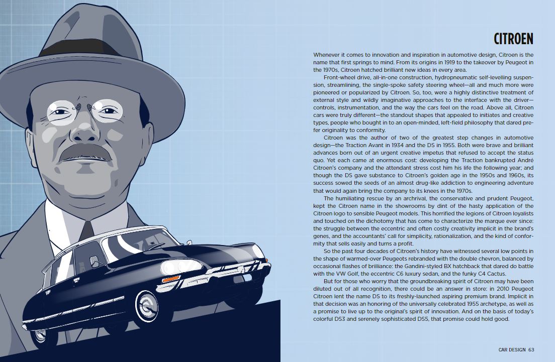
The new Speed Read book also highlights major manufacturers and designers, such as Pininfarina and Giorgetto Giugiaro. Here, the author explains how Citroen went from innovative and inspired products to being a brand of Peugeot.
Moreover, the content at VeloceToday is mostly oriented towards the great French and Italian designs of the past, not what is on sale in France and Italy today, and this book is about modern car design. But I have a hunch that our readers, who I would count as among the more sophisticated car enthusiasts, are interested in what makes a design work, whether prewar, postwar, or in the 21st century. It is a big topic. This book is published as part of the “Speed Read” series by Motorbooks. Founded in 1965, Motorbooks was acquired by The Quarto Group in late 2007. This new series “follows a format designed for speedy reading in the digital age…with accessible language, compartmentalized sections, fact-filled sidebars, glossaries of key events, and event timelines.” In other words, it is not like reading Laurence Pomeroy’s “The Grand Prix Car 1906-1939.”
Other books in this series cover Mustang, Porsche, F1, Ferrari, and Supercars. There are two other divisions: the “Speedpro” series, which covers performance modifications to MG, Triumph, etc., and “The Life” series, covering Vespa and Harley-Davidson, so far. It is a space worth watching.
The book is 160 pages, and for each copy page there is a facing illustration page. Each of the seven sections has an introduction and its own glossary. When you count just the text pages, which are only 6 ½ by 9 inches, excluding illustration pages, glossaries, indexes, etc., I counted only 59 pages of actual text. This is a pretty rigid formula for any author, and Lewin understands this well.
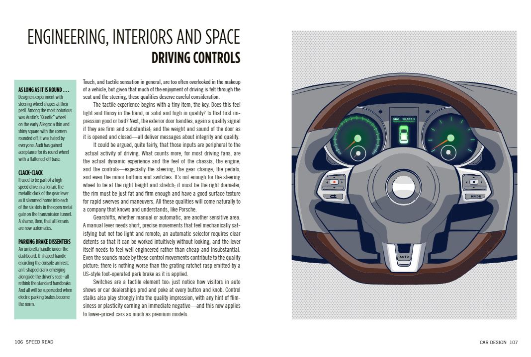
Despite being a slim volume, the book covers almost every aspect of car style and design in informative sections. We liked the concept and layout of the book.
I found the most interesting parts to be Section 4, “The Elements of Style,” and Section 5, “Engineering, Interiors, and Space.” Here, Lewin shows us that he has a good understanding of what today’s designers are juggling with in addition to the traditional properties of height, width, glass to metal ratio, stance and stature, and relationship to the road. This is about selling cars, and today’s consumers need to be motivated to purchase by other factors, such as paint, color, lighting, crease lines, graphics, safety standards, crashworthiness, identity and branding, the character and expression of the headlights, interior architecture, switches, seatbelt paths, air bag protection, and the touch and tactile sensation of the key and steering wheel (!). The so-called “hard points” are somewhat dictated by the crash standards and government mandated fuel economy standards: the physical size and shape of the engine, the dashboard to front axle length, adequate sightlines, and number of seats and interior architecture, which is quite different for an SUV or CUV or a pickup truck (which is what most American consumers want), than for a sedan or coupe.
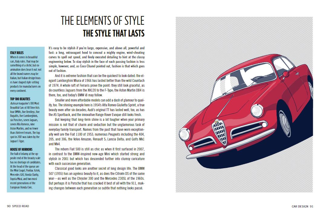
In sections divided by topic, the book explores the birth of car design, how it evolved over the last century, successes and failures in innovation, the elements that make up a car’s style, the engineering behind the design, the creative process and design fads, and finally the road ahead in car design.
Styling, as we have called it, takes a secondary role, as apparently it must, but things such as size and fit of the wheels, the proportion and profile of the greenhouse in relation to the lower body, and how the front and rear volumes balance the visual mass of the passenger compartment are still important, particularly as they relate to identity and branding. Ultimately, what the author is getting at is what he calls “the inherent attitude of the car.” A lot of this is shaped by the wheels and the pillars supporting the roof and the profile of the roof structure, and how the top of the fender meets the bodyside and extends rearward.
Lewin provides the last dose of realism with this sentence: “The overwhelming majority of design projects, however, are scheduled as part of a comprehensive product plan, and their main parameters are known well in advance. Here, the designers need to be just as imaginative: it may be that they can apply some ideas already in the pipeline, market research may have some useful pointers, and the values of the brand will of course need to be included.”
With the average new vehicle price north of $38,000, this is a Big Stakes game. And one of the biggest parts of the game is how the manufacturers are doing, an almost real-time topic that is best addressed by the most knowledgeable person in this space, Peter de Lorenzo, at his weekly website www.autoextremist.com, mandatory reading for car people, like…you.
I would recommend Lewin’s book to the people in your life who are not car people, but are interested in cars – a friend, family member, or co-worker. Here I think a “speed read” is appropriate, a good overview and introduction that might inspire them to learn more.
Sidebar: Harley and the Thunderbolt
I want to delve a bit deeper into what I feel is a critical aspect of car design which was much more important in the era we traditionalists favor: styling.
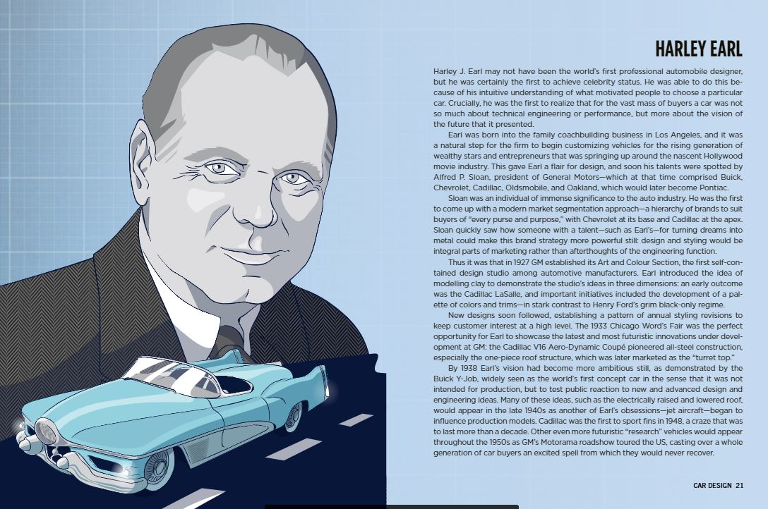
I want to use as a jumping off point, a comment by Lewin on page 52, “…the Buick Y Job is regarded as the auto industry’s first true concept car. It pioneered the horizontal grille….” On the contrary, it was E.T. “Bob” Gregorie who did this with the 1938 Lincoln Zephyr. The 1936 and ’37 Zephyr had a bad reputation for overheating, thanks to poorly designed exhaust passages, and a fan mounted on the end of the crankshaft, low in the engine bay. Gregorie measured between the frame rails and determined that the radiator could be mounted horizontally, not vertically as was common practice. He designed a new low grille in front of the radiator, and this solved the overheating problem. Gregorie is reported to have said that when Earl saw this for the first time, he lamented, “Oh my God, how did we miss on that one? This is going to ruin us!” A quick comparison of the grille of the ’38 Buick with the ’39 Buick shows that Earl was quick to appropriate Gregorie’s idea, almost intact, although I doubt if he gave Gregorie credit. That would have been unlike Earl.
If you will indulge me, I would like to illustrate the difference between good design and mediocre design. I am not a trained industrial designer, but my friend Phil Goldberg is, and I asked him to compare and contrast the “Y-Job” with the contemporary Chrysler Thunderbolt, which was shown at Pebble Beach last year.
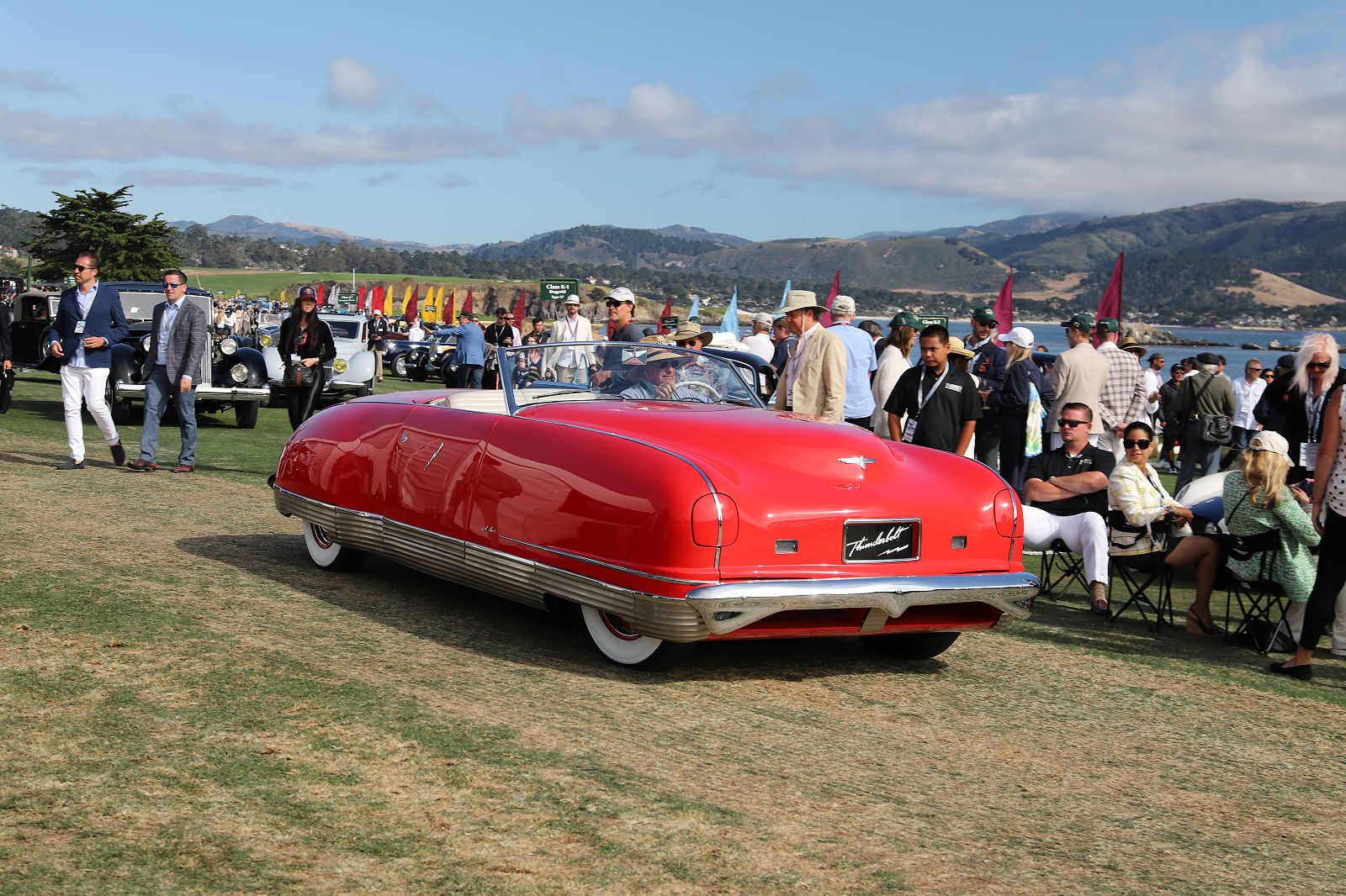
The Thunderbolt was styled by a 25 year old Alex Tremulis, working for Briggs. Tremulis was the chief stylist at Auburn Cord Duesenberg at age 22, after the departure of Gordon Buehrig. He is particularly famous for his work as chief stylist on the Tucker 48. Later he was a studio head for Ford Advanced Design. He was inducted into the Automotive Hall of Fame in 2014. Photo by Hugues Vanhoolandt
Goldberg had this to say:
“Earl is credited with the first concept car, the ‘Y-Job.’ In the context of its time, it is dramatically low (essentially, a ‘channeled’ body), its grille horizontal, and its proportions emphasizing width and lowness, much a GM cars would look a decade later. It is understandable that the public reaction was to swoon over this exciting step forward. And yet, looking beyond the initial visual shock and excitement, its predictive elements are few and far between. The few include fenders which fully enclose the headlights, the absence of running boards, and flush mounted door handles. The far-between would be front fenders that extend into the doors, a styling touch soon to be seen on a production car.
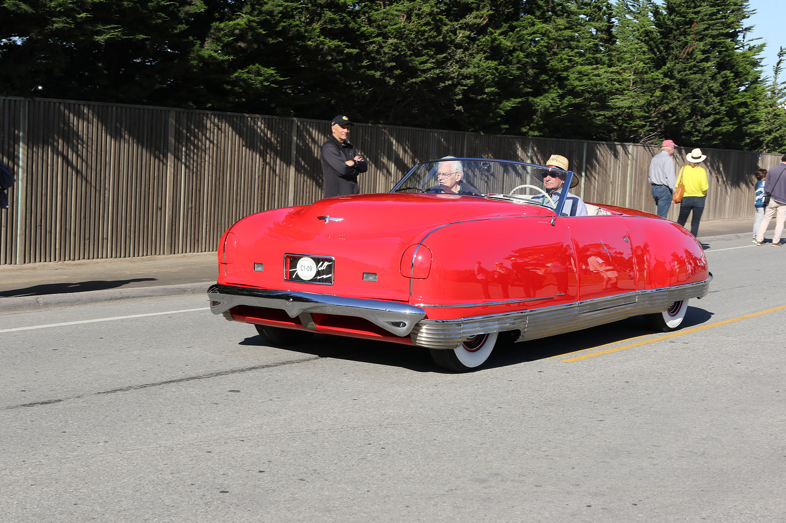
Here is what Tremulis said about his work on the Thunderbolt. ” All we had to do was to design and build a couple of the hottest streamlined cars since Rome burned, and slap them with a Chrysler nameplate!” Photo by Hugues Vanhoolandt
“On the other hand, the Chrysler dream cars were the Thunderbolt and the Newport. The designs were credited to Alex Tremulis, working for Briggs Body Co., which owned LeBaron Coachworks, one of the great carrozzeria of the Classic Era. The Thunderbolt (a convertible coupe like the Y-Job) is more profoundly predictive of automotive design elements to come. First and most dramatic is the full envelope aluminum body, lean, smooth, and sleek, with all four wheels partially covered by a striated rocker panel molding that wraps around the car, ending by curving behind the outer edges of the front and rear bumper. There is no front grille; the air intakes are below the bumper. There is a straight through fender line with no dips or belt moldings. Headlights are fully enclosed in the fenders, but are covered to enhance undisturbed airflow. The windshield is raked at an aggressive angle, and the top isn’t conventional; rather it is a one-piece folding metal top that retracts electrically behind the rear seat, leaving an unbroken line from behind the seats to the bottom of the decklid. The car is as smooth and seamless with the top up as it is retracted. There are no door handles; the doors open electrically. The Thunderbolt was a cohesive, coherent, all-of-a-piece design, while the Y-Job was (especially with its conventional top raised and fenders standing proud of the body), a dichotomy of old and new. While the Y-Job was exciting and futuristic, it was no way as cohesive, dramatic, and predictive of automotive design that lay ahead – that was forecast by the Thunderbolt, and forecast beautifully, as a work of art.”
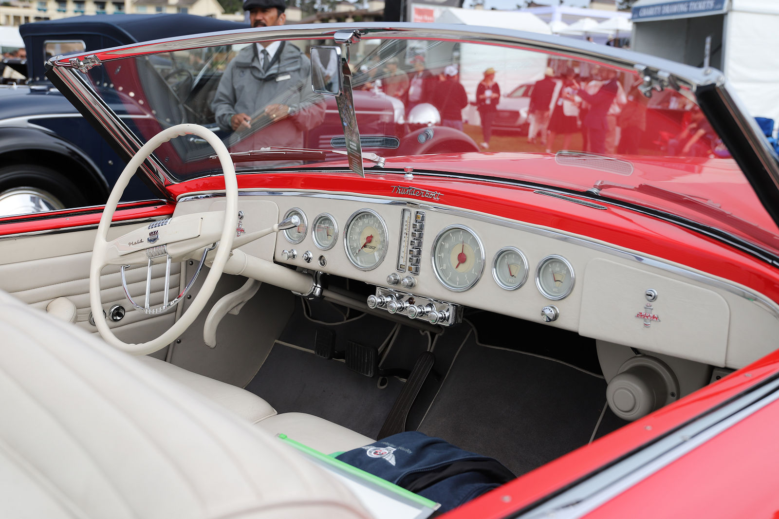
Tremulis said he was inspired to work on the Thunderbolt by his fascination for Land Speed Record cars, such as Frank Lockhart’s Stutz Blackhawk, Henry Seagrave’s Golden Arrow, and Donald Campbell’s Bluebird. Photo by Hugues Vanhoolandt
It is believed that a total of five Thunderbolts were built. Chrysler sold them off and kept one. Today four can be accounted for.
Certainly, automotive design is different today than it was eighty years ago when the Thunderbolt was built. But one thing is certain, which is that good design is timeless and anything less is not.
Dear Mr. Elitch,
I want to thank you for the reports on aforementioned books. I occasionally like to look at my husbands monthly magazines, a featured article about new or old cars, a brief read about new technology.
After reading your article I am inspired to read a couple of these books you have obviously read and enjoyed all. Suddenly my eyes are being opened to the intricacies of building a car, the thought of why and how the design developed.
Please write more about books and true pictures are very good.
Looking forward to reading more from Mr. Elitch