By Wallace A. Wyss

By Wallace Wyss
The King is dead…
long live the King. Wasn’t that what they always said in the old movies? Anyhow, the sneak shots of the Ferrari 458 Italia are out a couple of months before its official roll-out, at least enough photos to enable this design critic to form an opinion and submit it ever so humbly to the cognoscenti, i.e., you.
The Ferrari 458 Italia is a robust-looking car; to sum it up in one sentence: “it takes the bizarre out of the Enzo” yet saves enough of the old car to make an all-new shape that is reminiscent of the late Enzo but still its own design. Although it may replace the 430, the 458 might be considered an “Enzo light”.
FRONT
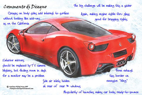
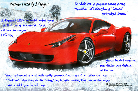
Painting the body outside the front intakes flat black removes any complaints about the front intake shapes which marred previous V8 mid-engined road cars. The headlights, proceeding up the fender line, are a bit too busy and sci-fi-styled. But since lights are asked to do so much these days, you can’t have normal headlamps on an exotic anymore. Ferrari revealed that it contracted with Audi for the LED technology. Ferrari didn’t realize was that this technology, in El Cheapo form, would soon be available at any Pep Boys or Auto Zone for kids to put on their Camaros, so what looked cool originally, quickly “trickled down” to low price cars. The hidden windshield wipers are well done. If there’s anything that compromises the cleanliness of a design it’s those big windscreen wipers. Now they should work on replacing the outside rear view mirrors with small rearward facing TV cameras and inside monitors. It requires no big tech breakthrough to do this, just finding a place on the dash to put the monitors.
The air intakes on the front fender are in an unusual place but don’t seem distracting either in front-3/4 or side view so I can’t object to their presence. The little eyebrow shaped air intake between the headlamps and the front bonnet take more getting used to–it looks like a trunk lid that was slammed down on a tool and permanently bent. But maybe in person I will hardly notice it when looking at the totality of the design.
SIDE
The back half of the car is bigger in side view than the front half, as fits a car whose drive train is all behind the driver. It’s like saying “This is the serious end.” The rear fender shape is very, very strong, and especially laudable is the way the body surface snakes upward below the rear 3/4 window area. The cleverness of putting the side air scoops just behind the window is good–doesn’t attract attention to the scoop but gets the job done. The lack of a bodyside vent was a bold departure—and makes the car look so much cleaner. The way the taillights show from the side is very Enzo-like. The side sculpturing that goes downward as the rear fenderlines arch upward is done well, not bevels and sculpture just for the sake of varying a smooth surface as they are on the disappointing California. The molded-in front spoiler is a bit distracting and thick-looking from the side but not noticeable from the front or front-3/4 view.
REAR
Backlite (rear window) gets an “A” and I like the way the curvy rear haunches of the car can no doubt be seen through the rear view mirror. On the tail lights: though Ferrari tradition in the Sixties was one tail light per side (275GTB, Lusso, etc.), I wouldn’t have minded two each side, a la Enzo. The mesh-covered vent should have gone all the way across for better cooling (they could still have floated the chrome horse over the mesh) and the way the vent cavities are cut off on the inside edges is at a weird angle for no reason. What was wrong with just straight up? I also question the reasoning for three exhaust pipes–I’m only looking at pictures but they seem to qualify for the appellation “excessive bling”. I would rather have had four exhaust tips, in the traditional sets of two, or two with space in-between and stainless steel, not chrome. Didn’t they also do something weird with exhaust pipes on the original 365GT4BB that they later had to correct?
IN SUM
The best part of the 458 is that it totally rejects the “folded paper” look of the most recent Lamborghinis by having every part of the body be a sensuous curve. Bear in mind, all the above comments are based on photos—I might be seduced and have entirely different thoughts when I see the car in person….
Ferrari 458 Italia Preliminary Specifications
Length 4527 mm (178.2 in.)
Width 1937 mm (76.3 in.)
Height 1213 mm (47.8 in.)
Wheelbase 2650 mm (104.3 in.)
Dry weight 1380 kg (3042 lbs)*
Chassis Material: aluminum and other alloys
Weight/power ratio 2,42 kg/CV (7.16 lbs/kW)
Weight distribution fr/r 42%/58%
Engine
Type V8 – 90°
Displacement 4499 cc (274.5 cu in.)
Maximum power 570 CV (425 kW)** @ 9000 rpm
Maximum torque 540 Nm (398 lbs/ft) @ 6000 rpm
Specific power output 127 CV/l
Compression ratio 12.5:1
Tires
Front 235/35 ZR20 8.5?
Rear 295/35 ZR20 10.5?
Performance
Maximum speed >325 km/h (202 mph)
0-100 km/h (roughly 0 to 60 mph) 3.4 seconds
Fuel consumption + emissions
Fuel consumption*** 13.7 mpg l/100 km
Emissions*** 320 g CO2/km
Gearbox
Dual-clutch, 7-speed F1
Electronics
E-Diff3, F1-Trac, high-performance ABS
* With forged wheels and Racing seats
** Including 5 CV of ram effect
*** Combined cycle (ECE+EUDC)
Wallace Alfred Wyss is a design critic and fine artist. He’ll be offering reproductions of his original paintings above in print form, with many more commentaries. For ordering information contact Order@albaco.net
I agree with the exhaust tip problem. It looks like a Corvette from the back, too much of a F40 look. The F40 was an outrageous car and the three tips fit the look. I think for this more simpler design, a fat one tip design would have been perfect. Or even some think unique, not round not square but a more flowing design of the other curves of the car.
Who wants to look at a tv screen anywhere near the center of the dash to see what’s off one of the car’s rear quarters? Put cameras on instead of mirrors if you must (I would never order wuch a thing) and put the screen just inside the A-pillar so the driver will look right to see what’s on the right side of the car, left for left. How I wish one could order a stripper supercar (like the first Miuras) and just add what is wanted…
I was thinking the little screens would be at the extreme edges of the dash, next to the doors, but dash space is precious these days. I hate TVs but after driving the latest Infiniti FX, I am warming up to them. Their screen showed a view as you are backing up, with lines to show how close you are and then, amazingly, a view of the car vis-a-vis the curb from about 30 ft. up, looking down. Computer generated of course.
I agree with you on the stripper (are we still talking cars here?) They should sell a running chassis with unpainted shell and let us go from there. And if you have a car like this it will attract strippers, the good kind and the bad kind…or maybe they’re all the bad kind.
The nicest view of this car is the sleek yet agressive hood slant to the snarling grill which actually looks more Maserati-like than Ferrari. Front brake vents like those on the 456 GT might improve the looks a bit.
Enough of this, though – any news on performance and handling?
There are no bad strippers. All strippers are good. Some are more appealing than others though.
I’m pleased to see a sculptured look
with flowing lines which reflects
the cars of the 60’s and 70’s. The tail lights are are out of place. I wonder who is going to see them from above except police in the air. They looked strange when Ford used this design on an older Mecury before they appeared on the Enzo and 430. I spoke to an owner of a new 430 and he loved the car but didn’t care for the tail lights.
The large diameter slim spoke wheels on the 458 make it look like an oversized baby buggy however it’s the best thing I’ve seen from Ferrari since the 355.
The best looking Ferrari since the Daytona, period. Ferrari must have looked closely at the designs that were put in by aspiring designers during a competition that Ferrari itself organized some years ago !
Is this design really exciting anyone? I think Ferrari has boxed themselves into a corner. From the front view the rear haunches resemble a Porsche Cayman so I would say this has already been done. What will the performance be? Damn fast! So what, it’ll be fractions of seconds better as if that makes a big difference on the roads we drive on. Ironically one of the most popular Ferraris was the 246 Dino which was a lower market model yet hit all the right notes. The 458 is red and expensive and hardly broke a sweat on any of the engineers or designers involved. Yawn….